The Technical Aesthetic in Advertising Design Services since 1986


Papers on Catalog Design Strategies That Work


A Designer’s Catalog Design “Style”.

One of the most difficult things to evaluate when choosing a design firm is “style”.  Since most designers create a design that matches their client’s needs, their portfolio may not show catalogs of the style you are looking for. It shows the style that those clients were looking for when they hired that particular designer. When reviewing our past catalog designs, please look at the quality of the work, and not necessarily the “style”. The “style” is determined not by what we have executed in the past, but by the immediate needs of the present project. A good designer will give you the catalog design you are looking for based on the research/discovery phase of the project. We start the hunt for the catalog design needed by providing new customers client questionnaires: one short and one long, to determine your market and where you are in that market. (Non-disclosure forms are available.) We do this because we like to learn about and address a market with an informed catalog design approach. We work to understand a company’s business as intimately as its employees because we know this is the only way to thrive in today’s business climate. We will not step over any issue on the path to creating a catalog that will make your cash register ring.

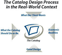
We always consider several possible approaches for your catalog design. When the “style” is set before hand,  this forecloses the creative back and forth process that arrives at a superior product.  We consider “style” an ugly word. Below is a graphic that determines what a catalog design should do or be and not its “style” which is irrelevant.

What-the-catalog-should-do-or-be

Some of the design elements and sales approaches we have implemented in projects for companies in other markets could be very applicable to your project. We have used this out of category strategy to successfully address our client’s needs. We inform our designs from a 30 year storehouse of design experience. We may even be rash enough to suggest selling or marketing procedures which seem to us, looking in from the outside, as likely to improve your existing marketing efforts.  We would welcome the opportunity to review your existing marketing plan at length.

Best wishes on a successful completion of your catalog.

Designing a Customer-Loyal Brand with Catalog Design.

  1. Challenge, Challenge, Challenge!!!!

Competition is everywhere. Everyone knows the given choices like never before, customers are more demanding. Quality differences are shrinking. Companies all know the same things and have the same technology and there are no real secrets anymore. The problem then becomes how to differentiate yourself.

  1. Products are Becoming All Alike.

How to create a distinctive brand when all products and services are becoming alike. Some companies use design to distinguish themselves. And this is not just product aesthetic, but the total customer experience. Concerning the product it’s using human factors, ergonomics and aesthetics to create a user friendly experience. On the customer experience side, where they feel welcomed, are able to interact with you and want to repeat the process.

  1. The Cost of Change

How to draw attention to your product and then make the leap to customer loyalty. Making the customer think less and increasing the trouble to switch is a way to create a customer – loyal brand. If it’s too complicated, the manual is unclear, or the physical design is misleading this causes the customer to think more and maybe think about another brand. It’s like your old familiar old store you have been doing business with for years. Going to another store is confusing because of a different layout. The level of thinking is reduced with your customer – loyal brand and the cost of change is high. This is what you want to achieve with your brand. The product itself, the manual, to “opening the box introduction” are all part of the desired brand.

  1. The Customer as Co-creator of your product.

The misconception is you can outsource the creation of your brand to designers and marketers. It is thought you can give direction to a consultant and they will come back with your brand, so it’s really just a thing you buy. You must realize how important it is for you the marketer of a product or service, to know what’s going on out there. How people use yours and everyone else’ s product. Make the customer the co – creator of the product. Form a design team with your customer, it’s just good business.

  1. Innovate Continuously

The essence of a customer – loyal brand is understanding. You must clearly understand your customer’s needs and anticipate future needs. By doing this better than the other guys, you create the right customer values and leverage them with your innovations. Anticipate and change your product, your process and yourself. You have to innovate continuously.

  1. Whose Cattle is it?

Branding originally comes from making a mark on your livestock to identify your cattle. So it’s all really about whose cattle it is and does your customer know it’s your cattle and your quality.

Can Print Catalogs Survive the Web?

  1. I love to look for stuff to buy that will solve my life’s problems?

I can sneak some time in my favorite chair, coffee in hand, and a well-designed catalog with goodies to buy, I am in heaven or as close I’m going to get.

  1. I like to shop online.

For the most part, I’d rather shop online. It’s faster, cheaper and you don’t have to talk to anyone. Amazon.com is my new best friend around the holidays. Just because I don’t have to go to the malls which in a good year I never go to. I buy all my computer gizmos at macmall.com and clubmac.com and LLBean.com and TheCompanyStore.com are a staple in my closet.

  1. I am a Geek.

Now you’d think, being the techno-geek I am, I’d be pleased that many of my favorite catalogs and stores have gone online with ecommerce. However, while I have visited and used their web sites many times, I prefer the good-old fashioned 800 number. My friend, a far bigger geek (he’s an engineer, need I say more?), looks at the catalogs in his recliner then launches his browser to order online. Makes me wonder if we’ll still be receiving printed catalogs in the mail five or ten years from now.

  1. Relationships Wanted

Internet retail sales are booming and are poised to hit $20.3 billion in North America according to the Gartner Group. But direct merchants are doing well too. According to the Direct Marketing Association, total U.S. catalog sales have almost double in the past decade to 94.5 billion in 1995 and growth is projected to $143 billion by 2005. Almost all consumer and business catalog has an online presence, and most are even making a profit from Web Site sales. That is good news, especially considering the current melt down of the dot-com economy. It is not surprising given the fact that direct merchants have preexisting relationships with customers who trust their customer service and order fulfillment capabilities. The fact is that the majority of shopping is done offline, and research shows that’s not going to change any time soon. The Web for most consumers is a resource to find product information, reviews, and comparative data, but actual purchases are usually done in a retail store or through a catalog. That’s why most online retailers have at least one other sales channel, and why so many current online-only businesses are launching companion catalogs.

  1. We Like the Catalog Type

There are many ways online retailers can market their products, through both electronics and print means, but the great ones are making sure print is essential component of their strategies. Direct email can include embedded digital images, DHTML that allow recipients to shop without launching browsers, and streaming media that offers a more interactive experience. But most consumers trash direct email before they open it, or don’t have the bandwidth or the

E-Catalog Business to Business Myths

Myth 1 Business to Business is different from Business to Consumer.

In my 29 years of catalog experience, this is the most common myth. Studies shows that the top problem Business to Business (B-to-B) shoppers have is finding a product and making a purchasing decision. Sound familiar? Same problem with Business to Consumer (B-to-C).

Last year a midwest safety products cataloger gleaned from its research that the lack of standards in web merchandising and navigation often made it hard for potential customers to even start the process of finding a product. (What’s up with those really small words on web sites that we are supposed to somehow read and click on.)

Another Cataloger noticed visitors had trouble getting around because there was too much explanatory text in the navigation path. Customers shopping for themselves or their company don’t like to read while they navigate.

The Business customer is just like the consumer in many important aspects. Business customers are more impatient than consumers and have less time because they are at work. Consumers looking to purchase from home have more time and will keep trying–to a point.

Myth 2 Business customers are already knowledgeable about what they are looking for.

Just like the B-to-C marketer, they assume that their prospects know way more than they do. In one research project using a purchasing manager as a subject, he was unable to make a purchase from a B-to-B site because he was unfamiliar with some industry terms. B-to-B Marketers look at the world from the inside-out–from the company’s perspective rather than the customer’s. The same people, who are responsible for marketing, emphasize how their B-to-B market is so different from the

B–C market. They are the same professionals who tend to assume their customers have knowledge that they do not possess. It’s an easy mistake and it clouds the real issues that need to be clarified and communicated to the customer.

Myth 3 Business customers make the most optimal choice when navigating a web site.

When we’re designing our web site we assume the user, when navigating the site, will choose the best option after considering all the possible ways to go. In reality, in most cases he will not choose the best option. He will choose the first reasonable option – a strategy known as satisficing1 (a cross between satisfying and sufficing). On finding a link that we think will take us where we want to go – there’s a very good chance we will take it.

Studies of firefighters’ choice of options, in life and death situations, where thought to be governed by the generally accepted model of rational decision making: faced with a problem, a person gathers information, identifies the possible solutions, and makes the best one. In reality, the firemen didn’t compare any options-they took the first plan they thought would work and did a quick mental check for possible problems with the plan.

Why don’t we make the best choice:

We’re usually in a hurry.

There’s not much penalty for guessing wrong.

Weighing options may not improve our chances.

Guessing is more fun.


True Lies and Just The Facts

Regardless of your company’s size there are two vital activities that B-to-B marketers can perform:

Study Customer behavior early and often before and after launching a new site or major site revisions.

Build a customer experience team.

These two efforts may sound esoteric and even a little like consultant B.S. I’m not suggesting that you spend $50K on a focus group. However, they can be done without a consultant and can be informally done inhouse, but they must be accountable. Otherwise there’s this overblown inhouse meeting with arm waving and hearsay with no hard facts to support the “we know our customers” type comments that are handed down from on high. Your in-house informal research teams should be from different departments, not just from customer service, and multi-disciplinary. The benefits of including heads that come at the problem from different angles is that it creates a company consensus on priorities. The people behind the web presence are now talking to each other. This results in wonderful comments like “if we put Joe’s stuff here, by my offset swivel plates, I will sell more too! There is great synergy in knowing and hearing these comments from different departments.

It is not uncommon in the big scheme of print catalogs, customer service centers, and web sites, to have over 100 change requests to modify the web site. The multi-disciplinary team can weed out the top five to implement that will have the greatest business impact.

Amazon.com created a bulletin board of customer comments early on and incorporated the number one suggestion, “Where’s my stuff?” right on the main page so the customer could go see the status of his order. All this is the good news. The bad news is most small companies don’t do this and just give it lip service. And finally, the few that do do their customer-research due diligence will have a significant advantage over the other companies holding on to the self serving myths.

Ten Tips for Catalog Design that Work

The impact of a well-designed catalog on a successful product presentation is often overlooked. These tips will help you create a catalog design to gain the best results.

  1. Your catalog should reflect your brand identity.

If your catalog looks different than your store, which looks different from your Web site, you have a problem. Customers should see the same brand experience when they shop. That demands more than just using your logo.

Your brand personality should cross all media helping assure customers that they will receive the same quality and service everywhere. Coordinate the efforts of your retail, graphic and web designers to ensure consistency.

  1. Don’t take square-inch analysis too literally.

This ratio provides useful insights, but it should not be taken at face value. Cramming more merchandise on a page doesn’t add up to higher sales if the effect is to crowd the page and lower its visual content and make it a “wall of words”. Those who want a spread to “work harder” may find that overall sales will actually rise by featuring fewer items and glamorizing them with design and layout.

  1. Think in terms of the whole, not the individual pages.

A common mistake is focusing on what goes on a page rather than the visual impact of the catalog as whole. This can lead to tedious lookalike spreads. Catalogs benefit from pacing and surprise — simple silhouetted images, close-ups of details, wide angles, full-bleed photographs, lifestyle shots and the like sustain viewer interest and keep them turning pages.

  1. Know your customer.

Understanding who your are selling to is essential for selecting your merchandise, styling your photographs, describing the product in the right tone of voice and developing your mailing list. It will determine the image you present, whether urban or rural, high style or wash-and-wear.

  1. Don’t look upon feature copy as lost “selling space.”

Narrative catalog prose can enhance the buying process. Text may invite customers to enjoy the catalog in a leisurely manner and make the product selection more meaningful and unique. I must insert here that this article is manly based on business to consumer catalogs but the same psychology exist for business to business catalog.

  1. The most expensive product doesn’t have to be the biggest object on the page.

Keep in mind that the goal is not to sell one product, but to make the whole catalog sell. By making the editorial concept of the catalog more interesting, people spend more time with it and, as a result, more things in the catalog tend to sell.

  1. Making pages complex is visually too busy for the viewer. Most catalogs are visually busy — with eight to ten products per spread. If you shoot all products with complex backgrounds and propping, you magnify the busy-ness and confuse the reader. When planning photographs, limit the number used and make them large enough to be clear.
  2. Don’t rely on supplied photographs.

Cutting costs by using manufacturer-supplied product photographs usually ends up with a mixed bag of lighting, styling and photo quality. The catalog looks disjointed and something less than if could be. It may show the product, but it doesn’t support the brand. The look and feel of the design must reinforce who you are. Individual products will come and go, but the survival of your brand depends on communicating in a cohesive and consistent voice.

  1. Order forms are needed.

Since so much actual ordering is done by phone or on the company’s Web site, some catalogers believe that an order form is unnecessary. But research has shown that shoppers like to use the printed order form to list their purchases and gather the information they need. Especially for phone-in orders, this allows the operator to handle calls more accurately and efficiently.

  1. Don’t sacrifice production value.

Catalog shoppers can’t examine merchandise firsthand, so they base their trust on what they can feel and see— the quality of the design, photography, paper and printing. When budgets get tight, these details often get cut first, since companies reason that if the products are the same, people won’t notice. They do. Keep in mind that presentation communicates the integrity of the products and the credibility of the brand and, ultimately, has the greatest impact on sales.

Three Common Problems Using Freelancers to Get Your Catalog Design and how Lofty Designs Overcomes Them.

We have found companies experience three major frustrations during the catalog design process. Below we spell out the problems and show how we eliminate them.

Problem One: Too Many Hassles: Usually you spend countless hours running around getting all the information … Dealing with an “ar-Teest” who wants to express himself instead of promoting your products … Endless meetings and messages trying to make the designers understand what you want and need … Been there?

Problem Two: If you can endure the gathering phase of getting your product list together, get ready for the long wait while the design firm absorbs and sorts this info-typically your job is turned over to someone who can design but has never really thought about selling a product, only impressing their design peers with snazzy graphics … Ever say, “looks nice but why can’t you understand what we want?”

Problem Three: In a typical catalog design project there are always hidden costs involved. A design firm spends two days laying out a two-page spread with sixteen products laid out perfectly … you add three more and the pages have to be redone … a photoshoot is planned and the photographer stands around at $200/hr while the products are sorted out … a theme is chosen and then drifted away from … Sound familiar?,/p>

Whose fault is it when these problems occur? Without a controlling process, it’s the design firm’s fault. At Lofty Designs, we realize that getting a catalog together is a time-consuming process for you. You have your regular job to do-not managing people designing your catalog. That’s why we’ve committed to overcoming the problems you face working with a freelancer or outside design firm-to making your catalog design process hassle-free, fast and predictable.


How Lofty Designs Solves the Problems: It’s the Designink process. The Designink process is driven to success by the simple fact that catalogs exist for a business reason, and that reason is to make the cash register ring. PERIOD. We make the catalog look good (we win awards) but we are more concerned with what the catalog should do or be:

We have a broad range of experience in graphic design: – We have over 30 years of catalog design experience.

We have personnel with specific industry experience: – We use design, marketing, journalism, retail and B to B sales experience.

Have years of experience designing sophisticated visual concepts: – Design, advertising, and illustration layouts using the latest techniques.

We can work at any level of involvement required:

– If you have ideas and want someone to fill in the gaps.

We have internal specialized checklists and procedures: – Insures an accurate communication of your product or service.

We understand the industrial and technical arts: – We know CAD, wiring diagrams, injection molding, welding, woodworking etc.

We are accustomed to the economic realities: – We work with tight schedules and limited resources.

We can work from existing materials: – Give us your napkins and we’ll product your catalog.

We focus on and are experts in graphic design: – Design and plan the catalog so the cash register will ring.

Tips for the Effective Design Brief

  1. Corporate Profile

Even if your corporate name is more famous than Madonna’s, don’t assume everyone knows what you do. People may only know your company by name, or have an outdated image of what you do, or think of you too narrowly in terms of one product or one market area. A designer’s erroneous assumptions about your business can skew the entire opening discussion, so first provide a synopsis of your current line of business, market emphasis and reach, along with pertinent historical highlights.

  1. Market Position

Provide a realistic evaluation of your organization’s, service or brand relative to your competitors. How is your company unique or different? What is your standing in the industry? What marketing communications techniques are most effective among your competitors. Provide the designer with competitive marketing pieces.

  1. Current Situation

Explain the situation that instigated the need for this project. Examples: Our brand identity isn’t working anymore. The babyboom generation thinks of us fondly from their youth, but their children consider us too conservative. We’re about to launch a big push into global markets, and our packaging hasn’t changed since we were a regional company. We just went public and need to be taken seriously by Wall Street.

  1. Business Objectives

What do you want to achieve?  If it’s a catalog design, what attributes do you want to convey? Define your objectives. Think of your catalog as a store. Ask yourself these questions…

What would you put upfront to get people to come in?

What kinds of service would to offer your customers as they looked around?

How much help would your customers need?

How easy is it for them to make a purchase?

  1. Target Audience

Who are you trying to reach? Are you reaching them now? If not, what do you feel is missing? For multiple audiences, rank them in terms of importance. Provide demographic information, if relevant. Explain any unusual or unique attributes about your audience.

  1. Corporate / Brand Personality

What is your image in the marketplace? How do you want to be perceived? Cutting edge? Relaxed and friendly? Trendy and elegant? Inexpensive and approachable? What subliminal messages do you want to convey? Jot down a list of adjectives describing the image you want to project and another describing messages you want to avoid.

  1. Budget

Until you know what form the solution will take, it’s hard to define a budget. However, it usually helps to state a ballpark figure for the total project, so that the designer knows whether you are thinking about a three-panel brochure or a 48-page full-color book. Some companies undertake design projects so infrequently, they have no idea how much things cost. They come in with lavish samples of what they want, only to discover that something comparable would wildly exceed their budget. In fairness to the design process, ti is important to provide a budget range, so that the designer can develop a concept with that in mind – or advise you early-on that the ideas you want to execute will cost more than is currently budgeted. Don’t try to breakout the budget by line items -i.e., design, photography, printing, paper, etc.; let the designer do that once the solution is defined. When it come to budgeting at this early stage, it’s important to build in flexibility, so that you don’t miss an opportunity to get the perfect solution, which may happen to cost just a few dollars more.

  1. Schedule and Deadline

What absolute targets must be met? A product launch at a conference that happens once a year? An SEC filing? A Board of Directors’ presentation? If this is a program with many elements, is there a rollout sequence? Does the print advertising have to coincide with the brochure distribution, for instance? State any interim targets that must be met during production–such as showing mockups to the brass hats in week 5. And most importantly, when the project must be completed.

  1. Design Medium

What medium do you have in mind for the design? A print piece, advertising, packaging, Web site, poster, exterior signage, CD-ROM, video, multimedia interactive kiosk – or all of the above? Do you have a particular size in mind – e.g., a 24-page self-cover brochure, a direct mail piece that fits a no. 10 envelop? In some cases, the situation will dictate the medium; in others, the best medium may emerge through an audit and analysis of your needs. State your preference, but keep an open mind.

  1. Technical and Practical Constraints

Does the designer have to stay within certain parameters? Is it a point-of-purchase catalog that has to meet specific supermarket or instore guidelines? A brochure that has to be translated into three languages? Packaging that must include recycled materials? If there are inflexible constraints, state them up front. Don’t base your parameters simply on the fact that “it’s always been done that way,” because you may prevent your designer from coming up with a solution that no one has ever considered before.

What I’ve Learned from Catalog Printers

From dealing with printers, I’ve learned a great deal over the years about obtaining print/paper/fullfillment bids. It’s not a simple process. For example, if you base your printer selection on print manufacturing and paper costs only, you could be coming to the wrong conclusion. This focuses on what’s driving costs and other factors you might not be considering when obtaining print bids.

Make certain you’re obtaining bids from catalog printers and not just printers. Catalog printers understand the distribution of catalogs and are able to co-mail. Even if a printer that’s really not a catalog printer is competitive when it comes to print manufacturing and paper, its ability to obtain maximum postal savings could be limited.  Fulfillment & postal cost can be a deal breaker for you budget.

Understanding the toal cost of direct selling is critical to understanding why you should only be dealing with catalog printers. Here’s a breakdown of printing, paper, and distribution:

  • printing and ink (20 percent);
  • paper (30 percent);
  • postage (45 percent);
  • prospect lists (3 percent); and
  • service bureau fees (2 percent).

Only 20 percent (approximately) of the total cost to print and mail a catalog is print manufacturing, 30 percent is paper and postage represents almost half the total cost. Therefore, a printer’s ability to co-mail for maximum postal discounts is critical to the net amount you pay for postage. Prospect lists and merge/purge work (service bureau) represent approximately 5 percent of the total cost combined.

The printers you’re obtaining bids from need to include a “net” postage estimate, including all fees. Looking at print manufacturing and paper prices only isn’t enough. It falls short of the total amount you pay to print and mail catalogs. After all co-mail fees, the net savings should range from three cents to six cents per catalog. There’s a fairly wide range of savings due to the quantity mailed. Some printers charge a flat per thousand amount for in-line co-mail services and a percentage of the savings for offline mailers. Also, some printers charge a per hundred weight fee for drop-ship separate from co-mail. Other printers often charge co-mail administrative fees or freight charges to get the catalogs to their co-mail facility. This can generate fuel surcharges and lengthen lead times. You really don’t want to move all that paper around on a truck after it is printed.

From my experience in the print and production world, roughly 70 percent of printers co-mail offline, while the other 30 percent co-mail in-line. Obviously, those in-line co-mailing are mailing much larger quantities. A catalog marketer would only have up to six partners for an in-line co-mailing, while they can have up to 30 partners when they offline co-mail.

Another consideration in the entire print bid RFP involves lead times — i.e., when mail tapes are due to the printer. One printer I know requires all mail tapes 40 days prior to the mail date, which is basically 50 days before the catalogs are in-home. This policy reduces the use of “hotline” buyers by approximately 30 days. Mail tapes due 20 days prior to a mail date, however, is more common. One printer I work with requires mail tapes just 14 days in advance. When obtaining print bids, be sure to ask your printer when mail tapes are due. At the same time, also ask when creative files are due based on your given mail dates.

When I obtain print bids for clients, I spend the most time on distribution considerations. It’s difficult for catalogers to understand the co-mail process. Often printers quote gross postal savings rather than net savings, for example. The main items to focus on are the actual postage amount plus any co-mail and distribution fees. Again, catalogers get caught up in the gross savings per thousand catalogs and/or the percentage of savings and neglect to look at the cost side of the equation. It’s easy for a printer to manipulate a co-mail estimate to show a high savings per thousand catalogs while the net amount in your pocket will be less in the end. Have the printers you’re considering process a recent mail tape in order to provide an accurate postage estimate net of all fees.

I think you’ll find that most catalog printers are extremely competitive when it comes to print manufacturing and paper pricing. Print manufacturing prices have actually come down over the past few years and the margins printers once enjoyed have been squeezed. The difference between printers comes down to postage and distribution costs.